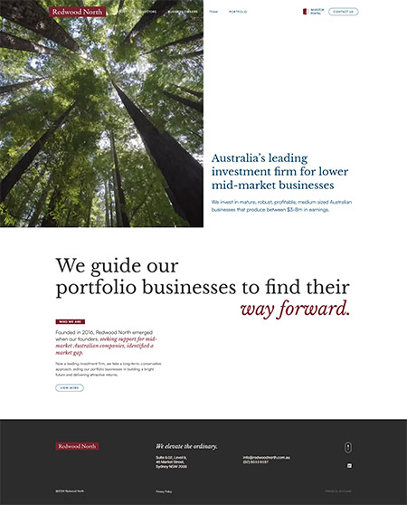
Redwood North
Jimmyweb designed and developed the website for Redwood North, an Australian private investment firm focused on acquiring and growing established, profitable businesses in the lower mid-market. Built on a custom WordPress foundation, the project leans into a minimal, deliberately understated design language that reflects the firm’s patient, long-term investment philosophy and steps away from the predictable visual clichés common to the sector.
Redwood North is an Australian private investment firm focused on acquiring and growing established, profitable businesses in the lower mid-market. Their approach is grounded in patience and discipline, targeting companies with strong fundamentals and long-term potential rather than chasing short-term gains. With a philosophy centred on elevating overlooked businesses, Redwood North positions itself as a steady, thoughtful partner for growth. This measured, confident approach is what differentiates them, and it needed to be clearly reflected in their online presence.
Redwood North required a website that was clean, modern, and minimal, but also responsive, user-friendly, and capable of clearly communicating their investment strategy and track record. On the surface, this sounds straightforward. In reality, achieving clarity through simplicity is one of the more complex challenges in digital design.
The investment space is saturated with predictable visual language and generic messaging. Many firms rely on the same signals of credibility, often resulting in websites that feel interchangeable. Redwood North wanted to move away from this. The challenge was to create something distinctive while maintaining the trust and authority expected in the financial sector.
Equally important was usability. The site needed to guide users effortlessly through the firm’s philosophy, approach, and portfolio. Information had to be structured in a way that felt intuitive, without overwhelming the user or diluting the message. Every interaction needed to feel considered and purposeful.
What We Did
We approached the project with a focus on clarity, restraint, and alignment between design and content. The layout system was built around strong structure and generous spacing, allowing each section to stand on its own while contributing to a cohesive overall flow.
Typography was treated as a key design element rather than just a functional layer. We used clean, refined type styles to create a clear hierarchy, ensuring that headlines delivered impact while body content remained highly readable. This balance supports both quick scanning and deeper engagement.
Visually, we deliberately avoided the clichés commonly associated with investment firms. Instead of relying on overused imagery, we selected visuals that felt grounded and authentic. The result is a more understated and confident aesthetic that reflects Redwood North’s long-term approach.
We also ensured the site performs seamlessly across all devices. The responsive design maintains its clarity and elegance whether viewed on desktop, tablet, or mobile. Navigation is simple and intuitive, allowing users to move through the site without friction while always understanding where they are and what comes next.
The Tech Stack
The website was built on WordPress using a fully bespoke design and custom development framework. This approach allowed us to create a tailored experience without being constrained by pre-built themes or rigid templates. We implemented speed optimisation techniques including efficient asset handling, streamlined code, and fast-loading page structures. This ensures the site feels responsive and polished, reinforcing the sense of professionalism.
Bringing It All Together
The finished website reflects Redwood North’s identity with clarity and precision. Every element, from layout to typography to imagery, works together to communicate a calm, confident presence.
The minimal design is not just aesthetic. It is strategic. By removing unnecessary elements, the site allows the firm’s philosophy and expertise to take centre stage. This creates a more engaging and trustworthy experience for users.
What We Loved
We loved the discipline behind the design. Creating something minimal that still feels distinctive requires careful thinking and attention to detail. Every decision matters, and that made the process both challenging and rewarding. The final result is visually elegant without feeling overworked. It has a quiet confidence that aligns perfectly with the brand.
What They Loved
Redwood North appreciated that the site avoided the usual stock-market clichés. There are no predictable visuals or overused design shortcuts, which helped position them as a more thoughtful and modern investment firm. They also valued how the site communicates their message clearly and naturally. The combination of clean design and aligned copy creates a cohesive experience that feels true to their brand.
What did we do?
- Discovery + Strategy
- Custom Website Design
- Responsive Mobile-Ready
- CMS Customisation
- Creative Direction
- Website Development
- Wordpress Development
- Website Hosting
- Speed Optimisation
- Ongoing Maintenance + Support


