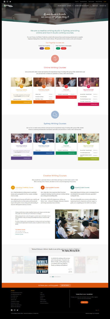
The Writers Studio
Jimmyweb designed and developed the website for The Writers Studio, an Australian writing school offering structured courses, mentorships, and manuscript development pathways for serious writers. Built as a bespoke WordPress site with a content-first focus, the project uses considered typography, generous spacing, and a calm editorial layout that invites users to slow down, read, and engage with the depth of the programs on offer.
The Writers Studio is a respected Australian writing school dedicated to helping serious writers develop their craft. Offering structured courses, mentorships, and manuscript development pathways, the organisation has built a strong reputation for nurturing emerging and established writers alike. What sets The Writers Studio apart is its focus on depth and discipline. It is not positioned as a casual creative outlet, but as a place for committed writers who want to improve, publish, and build lasting skills.
The brief was to design a website that immediately signalled intent. This was not a platform for casual browsing or quick inspiration. It needed to speak directly to people who take writing seriously, while still remaining welcoming and accessible.
One of the key challenges was balancing content depth with usability. Writing education naturally involves detailed explanations, layered course structures, and nuanced messaging. Without careful design, this can quickly become overwhelming. The goal was to present this information in a way that feels clear and navigable without stripping away its richness.
There was also a tonal challenge. The site needed to feel intelligent and literary, without drifting into academic rigidity or becoming visually dull. It had to reflect the thoughtfulness of its audience while maintaining a sense of warmth and approachability.
What we did
We approached the design with a content-first mindset. Typography, spacing, and layout were carefully considered to support long-form reading and exploration. The interface is calm and structured, allowing users to move through the content without distraction.
We also focused on improving navigation across the site’s many offerings. Courses, workshops, and mentoring pathways were organised into a logical structure that allows users to quickly understand where they are and what to explore next. This helps reduce friction while preserving the depth of information.
The result is a site that feels composed and purposeful. It invites users to slow down, read, and engage, rather than skim and move on.
The tech stack
The website was built on a bespoke WordPress framework, tailored to support the site’s content-heavy nature. Custom components were developed to handle course structures, program details, and editorial content in a consistent and flexible way. The backend was designed with ease of use in mind, allowing the team to manage and update content without complexity. This ensures the platform can evolve alongside the organisation’s programs and offerings.
Bringing It All Together
This project highlights the importance of aligning design with audience expectations. By focusing on clarity, tone, and structure, the site creates an experience that feels both intelligent and approachable.
Users are given space to think, read, and explore. The design does not rush them or attempt to convert them immediately. Instead, it builds trust through consistency and clarity.
The final result is a platform that reflects the values of The Writers Studio, supporting both its educational goals and its reputation as a serious writing institution.
What we loved
We loved the opportunity to embrace clean, minimal design principles in a way that genuinely serves the audience. The site respects its users, assuming they are thoughtful and willing to engage deeply with the content. That approach shapes everything. It creates a quieter, more considered experience that feels aligned with the craft of writing itself.
What they loved
They appreciated the clarity and restraint of the design. The site does not rely on gimmicks or unnecessary visual effects to hold attention. Instead, it focuses on editorial clarity and readability. The calmness of the layouts supports the content, allowing the writing to take centre stage and reinforcing the purpose of the platform.
What did we do?
- Discovery + Strategy
- Custom Website Design
- Responsive Mobile-Ready
- CMS Customisation
- Creative Direction
- Website Development
- Wordpress Development
- Website Hosting
- Speed Optimisation
- Ongoing Maintenance + Support


