Aquamore

Project: Wordpress Website

Sector: Professional ServicesFinancial Services

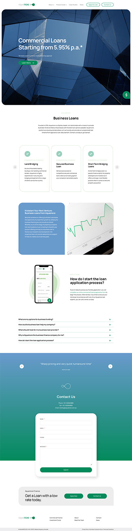
Jimmyweb designed and developed the website for Aquamore, an Australian private lender offering flexible commercial finance solutions across bridging loans, secured lending, and investment opportunities for businesses, developers, and investors. Powered by a bespoke WordPress build, the site sits confidently between traditional banking and fintech, communicating institutional credibility while reinforcing the brand’s promise of speed, structure, and responsiveness.

Aquamore is an Australian private lender focused on delivering flexible commercial finance solutions to businesses, developers, and investors. With services spanning bridging loans, secured lending, and investment opportunities, the business positions itself as a responsive alternative to traditional financial institutions. What sets Aquamore apart is its ability to move quickly while maintaining a strong sense of structure and reliability, offering clients both speed and confidence in complex financial situations.

The brief centred on achieving a careful balance. The website needed to communicate institutional credibility while also reinforcing Aquamore’s promise of speed and accessibility. In the finance sector, trust is everything, but so is clarity. Users need to understand offerings quickly without feeling overwhelmed or uncertain.

Another challenge was avoiding extremes. Lean too far into traditional banking design and the brand risks feeling slow and rigid. Push too far into fintech territory and it can feel overly casual or lacking authority. The site needed to sit confidently between these two worlds.

There was also a structural challenge. Commercial lending involves multiple products, pathways, and audiences, particularly brokers and business clients. The goal was to simplify this complexity through clear hierarchy and intuitive navigation, ensuring users could find the right information without friction.

What we did

We approached the design with a focus on clarity and confidence. The layout is structured and deliberate, using strong hierarchy and consistent spacing to guide users through the content. Each section is designed to communicate key information quickly, without sacrificing depth.

Visually, the site leans into a modern but restrained aesthetic. A refined colour palette and clean typography establish credibility while avoiding the cold, impersonal feel often associated with traditional banking websites. The design feels professional without becoming overly corporate.

We also paid close attention to user flow. Loan products and services were organised into clearly defined categories, supported by straightforward calls to action. This ensures users can move from understanding to enquiry with minimal effort.

The overall experience is composed and purposeful. It presents Aquamore as a capable and trustworthy lender while reinforcing the brand’s emphasis on efficiency and responsiveness.

The tech stack

The website was designed on the WordPress framework, allowing for complete flexibility in both design and functionality. Custom-built components ensure consistency across service pages, content sections, and calls to action. The backend was designed to be intuitive and scalable, enabling the Aquamore team to manage and update content with ease as their offerings evolve.

Bringing It All Together

This project demonstrates how thoughtful design can support complex business objectives. By focusing on structure, clarity, and tone, the site delivers a user experience that feels both professional and approachable.

Users are able to quickly understand Aquamore’s services, navigate between options, and take action without confusion. The design removes unnecessary barriers and supports decision-making at every step.

The final result is a digital presence that reflects the brand’s core strengths. It builds trust, communicates capability, and reinforces Aquamore’s position in the commercial finance space.

What we loved

We loved the opportunity to create a design that communicates financial confidence without relying on overly corporate conventions. The clean, minimal approach allows the brand to feel modern and credible at the same time. There is a balance to the design that feels considered. It is structured and professional, yet still accessible and easy to engage with.

What they loved

They appreciated the clarity and maturity of the final design. The site presents their services in a way that feels organised and trustworthy, without overwhelming the user. Most importantly, it reinforces the right message. The emphasis on trust, structure, and professionalism comes through clearly, supporting their positioning in a competitive financial market.

What did we do?

  • Discovery + Strategy
  • Custom Website Design
  • Responsive Mobile-Ready
  • CMS Customisation
  • Creative Direction
  • Website Development
  • Wordpress Development
  • Website Hosting
  • Speed Optimisation
  • Ongoing Maintenance + Support
Visit The Website
 

Don’t just take our word for it
– see what our clients say.

We've supported clients of every shape and size across Australia, producing exceptional creative work and outstanding results. See what some of our clients say - about what it's like to partner with us.


Tessuti Fabrics

Client Since: 2007
Visit: Tessuti Fabrics

EST 10 Recruitment

Client Since: 2021
Visit: EST 10

Mark Carter

Client Since: 2009
Visit: Mark Carter

Olympia Massage Chairs

Client Since: 2022
Visit: Olympia Massage Chairs

Jay's Air Conditioning

Client Since: 2025
Visit: Jay's Air Conditioning

01

Start Your Project

We craft custom websites that engage with your customers, boost online presence and credibility, and improve reach. Ready to start a project or really curious about our process? We’d love to hear from you and we’re more than happy to answer all your questions.