Milligan Health
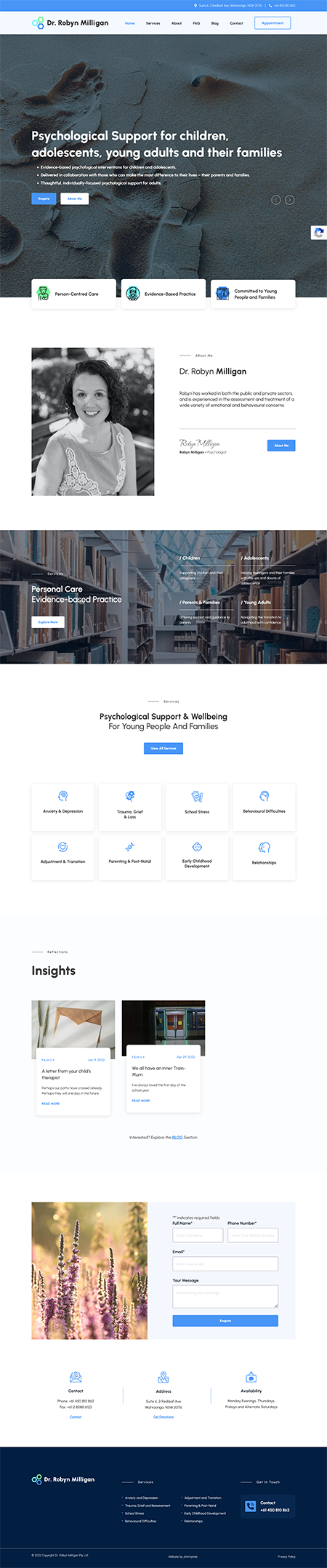
Jimmyweb designed and developed the website for Milligan Health, a specialist psychology practice focused on children, adolescents, young adults, and families, with a person-centred approach grounded in clinical expertise and genuine warmth. The site, a fully custom WordPress build, leans into calm, restrained design choices, soft visual hierarchy, and a refined colour palette, with a dual-path structure that lets visitors navigate either by life stage or specific concern.
Milligan Health is a specialist psychology practice focused on supporting children, adolescents, young adults, and families. With a strong emphasis on person-centred care, the practice is known for its thoughtful, tailored approach to mental health, working closely with clients to provide meaningful and practical support. What sets Milligan Health apart is its ability to balance clinical expertise with genuine warmth, creating an environment that feels both professional and deeply human.
The goal was to design and develop a website that accurately reflected the tone of the practice. This meant moving away from anything overly clinical or corporate, while also avoiding the generic “wellness” aesthetic that can feel impersonal or insubstantial. The site needed to feel calm, grounded, and trustworthy from the first interaction.
Equally important was clarity. Visitors arriving on the site may be navigating complex or emotional situations, often looking for support for themselves or their children. The structure needed to make it immediately clear who the practice works with and how it can help, without overwhelming users with too much information or unnecessary complexity.
There was also a strong need to build trust early. As a single practitioner-led service, the website plays a key role in establishing credibility while still maintaining a sense of approachability. Striking that balance between professionalism and warmth was central to the brief.
What We Did
We approached the project with a strategy-first mindset, focusing on clarity, usability, and emotional tone. The overall design direction is calm and restrained, using generous spacing, soft visual hierarchy, and a refined colour palette to create a sense of ease. Every element was considered through the lens of how a user might be feeling when they arrive on the site.
The information architecture was carefully planned to reduce friction. We structured the site so users could quickly identify whether the service is right for them, whether they are navigating by life stage or by specific concerns. This dual-path approach allows different types of users to find their way naturally, without needing to interpret complex navigation.
Typography and layout do most of the work visually, rather than relying on heavy graphics or effects. This results in a clean, highly readable interface that feels composed and professional. The design avoids unnecessary movement or distraction, allowing users to focus on the content and move through the site at their own pace.
We also ensured that calls to action were present but subtle. The site guides users towards making contact in a considered way, building confidence first before prompting action. This aligns with the nature of the service, where trust is a key driver of conversion.
The Tech Stack
The website was custom designed and built on WordPress, giving the client a flexible and scalable platform that is easy to manage day to day. The build focuses on performance and reliability, with speed optimisation ensuring fast load times across both desktop and mobile devices.
We also provide ongoing website hosting, maintenance, and support. This ensures the site remains secure, up to date, and performing consistently, while giving the client peace of mind that technical aspects are handled.
Bringing It All Together
The finished website is a clear reflection of the Milligan Health practice. It feels calm, professional, and approachable, creating a strong first impression for visitors who may already be in a vulnerable or uncertain state. The design supports the content rather than competing with it, allowing the messaging to come through clearly and confidently.
From a usability perspective, the site is simple and intuitive to navigate. Visitors can quickly understand who the practice supports, the types of challenges it addresses, and how to take the next step. This clarity not only improves the user experience but also helps ensure enquiries are more aligned with the services offered.
What We Loved
We particularly appreciated the restraint in this project. Rather than relying on visual trends or unnecessary features, the design is driven by a clear understanding of the user and their needs. The structure, spacing, and content hierarchy work together to create a calm, low-friction experience, demonstrating how effective thoughtful, strategy-led design can be.
What They Loved
The client loved how accurately the website reflects their practice. It feels aligned with their values and the way they work with clients, striking the right balance between professionalism and warmth. They also appreciated the clarity of the structure, noting that visitors now have a much better understanding of their services before making contact, resulting in more relevant and informed enquiries.
What did we do?
- Discovery + Strategy
- Custom Website Design
- Responsive Mobile-Ready
- CMS Customisation
- Creative Direction
- Website Development
- Wordpress Development
- Website Hosting
- Speed Optimisation
- Ongoing Maintenance + Support